
Rectangle Fauvist Work - Illustrator
Illustrator - Rectangle Fauvist Work
For the fauvist rectangle assignment, we had to take a public domain painting, and redo it with only the rectangle tool. I learned a lot from this assignment, how to use the rectangle tool, how to color different things, and how to simplify things when you're on a time crunch.

Initial logos - Illustrator
Initial logos - Illustrator
In the first art-board I used proximity between the h and d, putting them close together but still not touching. The second art-board is continuity, the h and d overlapping while making someone easily look from one letter to the next. Third is similarity, the font being the same while still overlapping. With number four, the h is a background for the d, letting it show from the white background. Finally we have five, the dynamic makes it look as if one letter hands from the other. With this project I learned how to use the text tools and some new words and their meanings.

Smart car - Illustrator
Smart car - Illustrator
For this we had to trace over pictures of smart car using the pen tool, afterwards we shaded and fixed it up with the gradient tool. This was a pain, but taught me a lot of useful things about the pen tool.

Warhol - Illustrator
Warhol - Illustrator
I decided to use a photo of one of our dogs, his name is Bruce. With this I learned how to create different works of art using many different tools, and how to simplify images to a certain amount of grouped colors.

Color Theory Grids - Illustrator
Color Theory Grids - Illustrator
From this project I learned a lot about how different colors go together, and what those groups are calls.

Animal practice - Illustrator

Animal practice - Illustrator
For this we practiced using the pencil and pen tool, we created the three animals to get a better hold on the tool. With this it helped me learn where certain tools were, and gave me more confidence when it came to those tools.

Fruit faces - Photoshop
Fruit faces - Photoshop
This was our very first project, from this we took faces, and edited them onto fruit. Pretty self explanatory, huh? This was our first introduction to photoshop, where I learned a lot of the basics like dodge bush, blending, and editing.
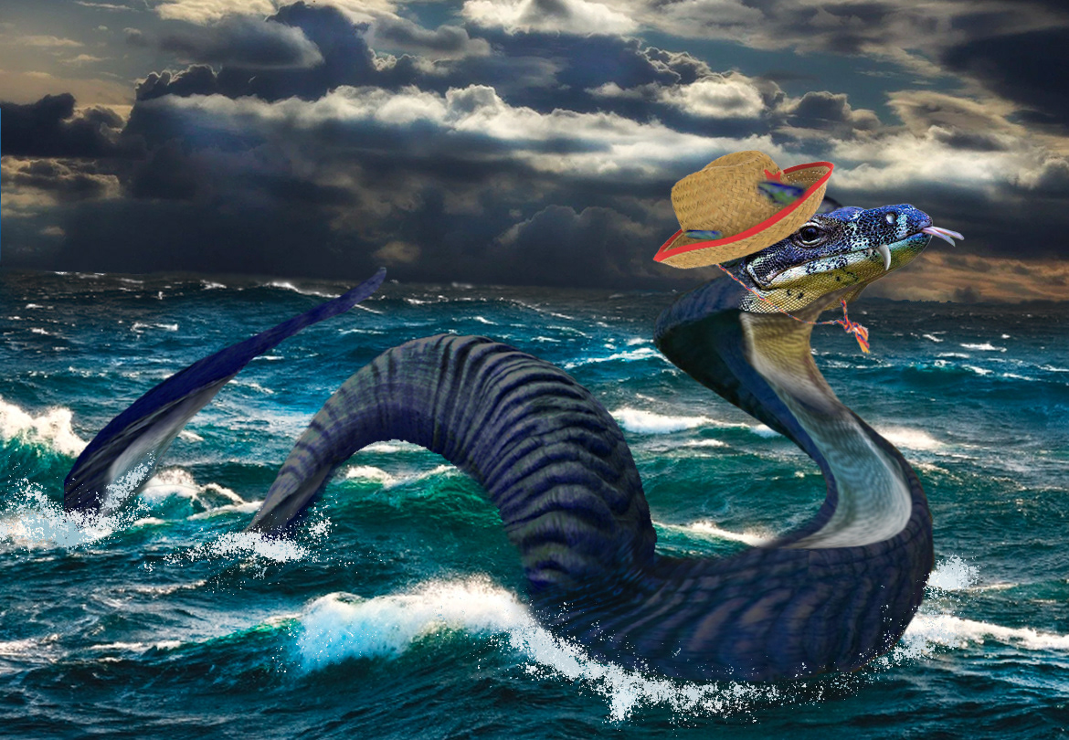
Sea Serpent - Photoshop
Sea Serpent - Photoshop
This is Freddy the rootin' tootin' sea serpent. To make him we learned how to take different parts of animals like- ram horns, lizard heads and fins, dino teeth and scale textures- and turn them into sea serpents. This really helped develop my skills when it comes to copy and paste along with things like the burn, transform and brush tools.

Worlds in containers #1 - Photoshop

Worlds in containers #3 - Photoshop

Worlds in containers #2 - Photoshop
Worlds in containers - Photoshop
In the mason jar I decided to go with an ecosphere jar, adding plants and small life in the bottom. The focal point for the jar is the fish, using a higher saturation and size to let it capture the main attention from the viewer. With The second image- the salt shaker- I placed a cat, some toys and a cat tree inside, bringing down the opacity and brightness of the form in the back to make it softer and smaller. The toys I lowered the contrast and let the cat stay how it was to catch the eye with the bright orange color. Finally, I made- #3 a cityscape in the crystal ball, lowering the opacity on the background and adding in a kid and his dog running to the foreground; making them the images focal point.

Cubism Mandolin - Photoshop

Cubism Self Portrait - Photoshop
Cubism - Photoshop
For this project we learned how to take the rectangle selection tool, make a copy of the image we wish and copy it before distorting, changing the proportion and shifting the hue of said rectangle. The two images above were created so, and to add another touch I took the original photo and shifted the contrast slightly. I increased the saturation of the rectangles just slightly to make it look like you're almost looking through smaller portals to the original pic below.

Surrealism - Photoshop
With this project we learned how to "melt" things. In the first image you see how the clock itself is fine, but it looks as if the face is melting right off the front. We did this by. using the liquify filter. In the second image you see how it looks like the eye has the clouds inside of it. That we did by placing the eye and face layer on top of the clouds, then carefully erasing the middle to show the background. Finally we put it all together and pieced together our own design. Mine is the representation of how anxiety can feel. Butterflies caught in your stomach with your brain turning to mush, feeling like the spotlights can be on you with someone always watching.

Pop Art - Photoshop
Pop Art - Photoshop
With this project we turned photos into pop art. We did this by taking three layers of the same photo. One left alone, one having a filter on it with the vibrance up, and the last placing the half tone effect on top.

Propaganda - Photoshop
Propaganda - Photoshop
For my topic I decided to go with wearing a mask. I learned a lot about how effective these pieces can be, the bold letters and clever sayings to get the viewers to agree. It taught me a few things about placement, and colors. For my design you see a silhouette wearing a mask, city line in the background. On the top and bottom of the screen, the scene is cut out to show the words, "the mask wont kill you, but covid will" in bold red letters.

Bauhaus Poster - InDesign
Bauhaus Poster - InDesign
For this project I learned a few basics of Indesign. A few of them were, how to create a textured background, how to make shapes and color them, and even save those colors. Using these skills I decided to change up the design of the tutorial we followed and make it my own. To do that I changed the amount of shapes, colors into a cooler set color scheme, and changing the introduction of bauhaus, to a couple quotes from Gandalf the Grey.

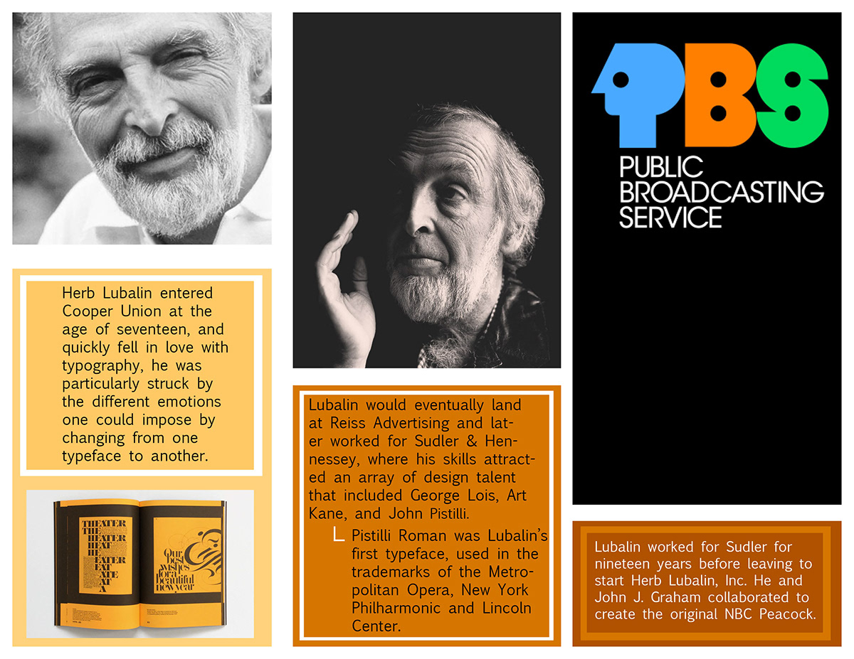
Herb Lubalin Brochure - Indesign
Herb Lubalin Brochure - Indesign
For this project we were required to make a brochure on Herbert Lubalin, while using the images and text provided along with an analogous color scheme of our choice. For mine, I decided to go with an orange, orange-ish red, and yellow color scheme. For the layout I placed the images first and put the boxes around where I wanted the text, keeping the same paragraphs together along with images provided to show what it talks about. I learned how to use the rectangle frame tool, the place tool and others through this project.
Bouncy Ball Animation Tutorial - After Effects
Mondrian Grid Animation - After Effects
Animation Practice - After Effects
This project was all about learning basic animation in After Effects. I learned where the tools were, how to create and customize new files, and how to use the layering system. I used the frame rate to be make sure that the animations weren't too slow, but not too choppy either. For the bouncy ball animation, I tried to add in how gravity would move the balls, making the larger ball more bouncy while the two smaller ones lost that bounciness quicker.
Logo Bump - AfterEffects
Logo Bump - AfterEffects
For the logo bump I decided to do a dollar tree advertisement, haven't seen one of those before. I decided to go with a fancier, white font to contrast the birch forest background I put in.
Name Animation - AfterEffects
Name Animation - AfterEffects
With this I decided to try out a few different animation presets, slowing some letters down and speeding up others to have things fit nicely together.
Alphabet Project - AfterEffects
Alphabet Project - AfterEffects
For this project I used a plain white background with a white blocky font to stick out. After typing out the entire alphabet I put a clock animation over each of the letters to try and get them to fit together. It worked out in the end, but for a bit of an extra touch I replicated the moving rectangle some TV's have when the screen is idle. And of course I turned it from purple to green once it hit the corner.
